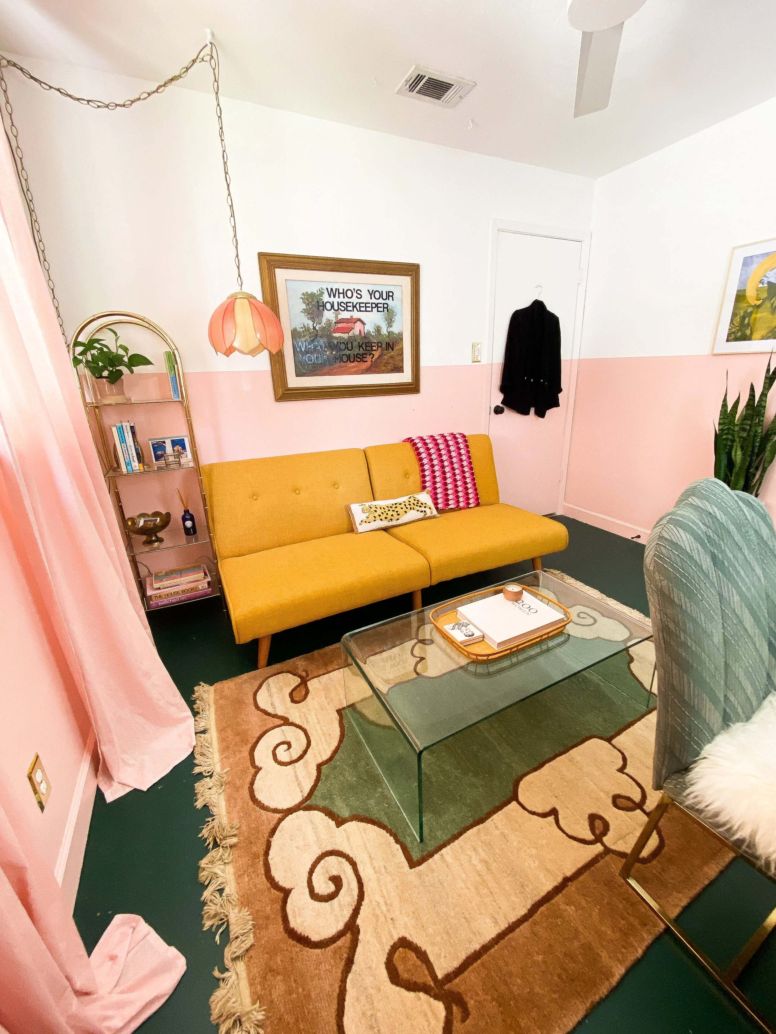
Before & AFter: Home Office Space Upgrades
So this funny thing happened where I submitted my home office renovation for a Before & After on Apartment Therapy back in July. I thought I was being ghosted, and honestly I wasn’t all that surprised, due to my self-deprecating anxiety. I was filled with regret the moment I hit send because I knew there were elements of the office I knew weren’t “perfect.”
But after some late night googling of my name last week to make sure a ghost of college past isn’t still lurking on the internet, I found that I was in fact published - several days after I submitted. 4 months ago. Oops, missed that one. And was so excited by the discovery!
Apartment Therapy - Before and After: A Bold Office Redo That’ll Turn Even Skeptics into Pink Lovers
A huge lesson for me is that my design process is iterative, which make blogging more difficult. I had to work in the space every day, take zoom calls and deal with terrible backlight caused by room layout and encounter problems to solve with design naturally. Also, another lesson is that the advice to never read the comments might be true, but you’ll have to keep reading to find out.
The Before Before
This room still feels insufferably boring to me. I wanted a clean slate with less conventional bones to work with, but still clean and modern.
Updates I made:
Carpet removal, to reveal (already) painted concrete and holes where carpet tack lived
Patch and re-paint concrete
Skim-coat walls to remove texture which was previously the classic orange-peel texture
Paint two-toned walls, Pure White on top and ceiling and Texas Rose on bottom and base boards
Replace outlet covers
Replace ceiling fan
The (After) Before
Another magical outcome of this conundrum: my worst fear about blogging and sharing my passion for design came true, and it wasn’t all that bad. I put off writing a blog for so long due to fear of negative feedback invading my psyche, or that I would publish something I would eventually hate. Well, fun fact I don’t really love that first version of my office that I submitted and also fun fact, I was more or less roasted in the Apartment Therapy public comments.
My style will never hit home with everyone, it’s funky, eclectic and not always on-trend. I was a little tender when I first started reading the comments, with the bad far outweighing the good. For the most part, I agreed with certain assessments and disagreed with others. But everyone is entitled to their opinion and personal taste. There were some nice comments for the record, but if you have anxiety you understand those don’t exist really. Also when you submit your work for publication, you are of course, agreeing to public commentary.
This isn’t the end of the world. If I had found these comments right after they were posted, while I was still working up the courage to keep blogging and developing my Instagram account they may have hurt me a lot more. But I realize there isn’t anything personal here, other than personal taste and some very real observations that are (mostly) helpful.
This is exactly like classes in college with a heavy peer review element: repeat the mantra with gusto, CRITICISM WILL HELP MAKE YOUR WORK BETTER.
Best to find a happy balance of constructive criticism to take on, and personal style elements to hold tightly since this space is in fact for long-term personal consumption and not mass celebration.
The After (Today)
I definitely resonated with some feedback from my Apartment Therapy post comments; the couch blocking the window was all wrong, the desk should definitely face the window for better view/lighting and that solved my zoom backlighting problem. If I had seen the Apartment Therapy article and comments sooner, I am actually worried I would have taken too much of the external feedback into account and ended up with something less me.
Pro-tip for video calls: A window behind you will always result in my before photo below, look at that happy girl in the after.
So let’s take a look at the rest of the space:
future plans
I love the space as it is now. I work in my office every day, in my capacity as a product marketing manager at a tech company from 9-5PM + and also as a creative space for blogging and my artistic endeavors. It’s functional, while still being playful and inspiring. Also I now have a vending machine for sparkling water aka my new office perk program.
The only big change I plan to make in the short term is flooring. My color palette does have a fun Wes Anderson vibe with the contrasting dark green painted concrete floor, but I can not get our painted concrete floors throughout the house to hold up to the torment of two dogs and frequent vacuuming.
So stay tuned as I brighten up the room even more, leaning towards a light pine luxury vinyl plank option for the office and the rest of the rooms in our house.


